摘要:实现各种表情效果图代码如下,复制即可使用
CSS3实现各种表情
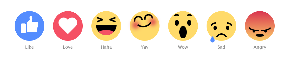
效果图:
代码如下,复制即可使用:
DOCTYPE html><html><head><title>title><style type="text/css">body {
  text-align: center;
  margin: 80px auto 0;
  font-family: "Lucida Sans Unicode", "Lucida Grande", sans-serif;}

.emoji {
  width: 120px;
  height: 120px;
  margin: 15px;
  background: #FFDA6A;
  display: inline-block;
  border-radius: 50%;
  position: relative;}
.emoji:after {
  position: absolute;
  bottom: -40px;
  font-size: 18px;
  width: 60px;
  left: calc(50% - 30px);
  color: #8A8A8A;}

.emoji__face, .emoji__eyebrows, .emoji__eyes, .emoji__mouth, .emoji__tongue, .emoji__heart, .emoji__hand, .emoji__thumb {
  position: absolute;}
.emoji__face:before, .emoji__face:after, .emoji__eyebrows:before, .emoji__eyebrows:after, .emoji__eyes:before, .emoji__eyes:after, .emoji__mouth:before, .emoji__mouth:after, .emoji__tongue:before, .emoji__tongue:after, .emoji__heart:before, .emoji__heart:after, .emoji__hand:before, .emoji__hand:after, .emoji__thumb:before, .emoji__thumb:after {
  position: absolute;
  content: ;}

.emoji__face {
  width: inherit;
  height: inherit;}

.emoji--like {
  background: #548DFF;}
.emoji--like:after {
  content: Like;}
.emoji--like .emoji__hand {
  left: 25px;
  bottom: 30px;
  width: 20px;
  height: 40px;
  background: #FFFFFF;
  border-radius: 5px;
  z-index: 0;
  animation: hands-up 2s linear infinite;}
.emoji--like .emoji__hand:before {
  left: 25px;
  bottom: 5px;
  width: 40px;
  background: inherit;
  height: 10px;
  border-radius: 2px 10px 10px 2px;
  box-shadow: 1px -9px 0 1px #FFFFFF, 2px -19px 0 2px #FFFFFF, 3px -29px 0 3px #FFFFFF;}
.emoji--like .emoji__thumb {
  border-bottom: 20px solid #FFFFFF;
  border-left: 20px solid transparent;
  top: -25px;
  right: -25px;
  z-index: 2;
  transform: rotate(5deg);
  transform-origin: 0% 100%;
  animation: thumbs-up 2s linear infinite;}
.emoji--like .emoji__thumb:before {
  border-radius: 50% 50% 0 0;
  background: #FFFFFF;
  width: 10px;
  height: 12px;
  left: -10px;
  top: -8px;
  transform: rotate(-15deg);
  transform-origin: 100% 100%;
  box-shadow: -1px 4px 0 -1px #FFFFFF;}

.emoji--love {
  background: #F55064;}
.emoji--love:after {
  content: Love;}
.emoji--love .emoji__heart {
  left: calc(50% - 40px);
  top: calc(50% - 40px);
  width: 80px;
  height: 80px;
  animation: heart-beat 1s linear infinite alternate;}
.emoji--love .emoji__heart:before, .emoji--love .emoji__heart:after {
  left: calc(50% - 20px);
  top: calc(50% - 32px);
  width: 40px;
  height: 64px;
  background: #FFFFFF;
  border-radius: 20px 20px 0 0;}
.emoji--love .emoji__heart:before {
  transform: translate(20px) rotate(-45deg);
  transform-origin: 0 100%;}
.emoji--love .emoji__heart:after {
  transform: translate(-20px) rotate(45deg);
  transform-origin: 100% 100%;}

.emoji--haha:after {
  content: Haha;}
.emoji--haha .emoji__face {
  animation: haha-face 2s linear infinite;}
.emoji--haha .emoji__eyes {
  width: 26px;
  height: 6px;
  border-radius: 2px;
  left: calc(50% - 13px);
  top: 35px;
  transform: rotate(20deg);
  background: transparent;
  box-shadow: -25px 5px 0 0 #000000, 25px -5px 0 0 #000000;}
.emoji--haha .emoji__eyes:after {
  left: 0;
  top: 0;
  width: 26px;
  height: 6px;
  border-radius: 2px;
  transform: rotate(-40deg);
  background: transparent;
  box-shadow: -25px -5px 0 0 #000000, 25px 5px 0 0 #000000;}
.emoji--haha .emoji__mouth {
  width: 80px;
  height: 40px;
  left: calc(50% - 40px);
  top: 50%;
  background: #000000;
  border-radius: 0 0 40px 40px;
  overflow: hidden;
  z-index: 1;
  animation: haha-mouth 2s linear infinite;}
.emoji--haha .emoji__tongue {
  width: 70px;
  height: 30px;
  background: #F55064;
  left: calc(50% - 35px);
  bottom: -10px;
  border-radius: 50%;}

.emoji--yay:after {
  content: Yay;
  animation: yay-reverse 1s linear infinite;}
.emoji--yay .emoji__face {
  animation: yay 1s linear infinite alternate;}
.emoji--yay .emoji__eyebrows {
  left: calc(50% - 3px);
  top: 30px;
  height: 6px;
  width: 6px;
  border-radius: 50%;
  background: transparent;
  box-shadow: -6px 0 0 0 #000000, -36px 0 0 0px #000000, 6px 0 0 0 #000000, 36px 0 0 0px #000000;}
.emoji--yay .emoji__eyebrows:before, .emoji--yay .emoji__eyebrows:after {
  width: 36px;
  height: 18px;
  border-radius: 60px 60px 0 0;
  background: transparent;
  border: 6px solid black;
  box-sizing: border-box;
  border-bottom: 0;
  bottom: 3px;
  left: calc(50% - 18px);}
.emoji--yay .emoji__eyebrows:before {
  margin-left: -21px;}
.emoji--yay .emoji__eyebrows:after {
  margin-left: 21px;}
.emoji--yay .emoji__mouth {
  top: 60px;
  background: transparent;
  left: 50%;}
.emoji--yay .emoji__mouth:after {
  width: 80px;
  height: 80px;
  left: calc(50% - 40px);
  top: -75px;
  border-radius: 50%;
  background: transparent;
  border: 6px solid #000000;
  box-sizing: border-box;
  border-top-color: transparent;
  border-left-color: transparent;
  border-right-color: transparent;
  z-index: 1;}
.emoji--yay .emoji__mouth:before {
  width: 6px;
  height: 6px;
  background: transparent;
  border-radius: 50%;
  bottom: 5px;
  left: calc(50% - 3px);
  box-shadow: -25px 0 0 0 #000000, 25px 0 0 0 #000000, -35px -2px 30px 10px #D5234C, 35px -2px 30px 10px #D5234C;}

.emoji--wow:after {
  content: Wow;}
.emoji--wow .emoji__face {
  animation: wow-face 3s linear infinite;}
.emoji--wow .emoji__eyebrows {
  left: calc(50% - 3px);
  height: 6px;
  width: 6px;
  border-radius: 50%;
  background: transparent;
  box-shadow: -18px 0 0 0 #000000, -33px 0 0 0 #000000, 18px 0 0 0 #000000, 33px 0 0 0 #000000;
  animation: wow-brow 3s linear infinite;}
.emoji--wow .emoji__eyebrows:before, .emoji--wow .emoji__eyebrows:after {
  width: 24px;
  height: 20px;
  border: 6px solid #000000;
  box-sizing: border-box;
  border-radius: 50%;
  border-bottom-color: transparent;
  border-left-color: transparent;
  border-right-color: transparent;
  top: -3px;
  left: calc(50% - 12px);}
.emoji--wow .emoji__eyebrows:before {
  margin-left: -25px;}
.emoji--wow .emoji__eyebrows:after {
  margin-left: 25px;}
.emoji--wow .emoji__eyes {
  width: 16px;
  height: 24px;
  left: calc(50% - 8px);
  top: 35px;
  border-radius: 50%;
  background: transparent;
  box-shadow: 25px 0 0 0 #000000, -25px 0 0 0 #000000;}
.emoji--wow .emoji__mouth {
  width: 30px;
  height: 45px;
  left: calc(50% - 15px);
  top: 50%;
  border-radius: 50%;
  background: #000000;
  animation: wow-mouth 3s linear infinite;}

.emoji--sad:after {
  content: Sad;}
.emoji--sad .emoji__face {
  animation: sad-face 2s ease-in infinite;}
.emoji--sad .emoji__eyebrows {
  left: calc(50% - 3px);
  top: 35px;
  height: 6px;
  width: 6px;
  border-radius: 50%;
  background: transparent;
  box-shadow: -40px 9px 0 0 #000000, -25px 0 0 0 #000000, 25px 0 0 0 #000000, 40px 9px 0 0 #000000;}
.emoji--sad .emoji__eyebrows:before, .emoji--sad .emoji__eyebrows:after
文章版权归作者所有,未经允许请勿转载,若此文章存在违规行为,您可以联系管理员删除。
转载请注明本文地址:https://www.ucloud.cn/yun/1906.html
摘要:跟大家分享一个款基于的自定义表情编辑器您可以在编辑器中为该人脸表情添加和改变各种面部表情给它戴上帽子,戴上围巾,甚至可以将其他任意表情添加上去,是不是很酷。源码我已经分享出来了,希望对大家学习有帮助。 跟大家分享一个款基于HTML5、js、CSS3的自定义表情编辑器 您可以在编辑器中为该人脸表情添加和改变各种面部表情、给它戴上帽子,戴上围巾,甚至可以将其他任意Emoji表情添加上去,是...
摘要:跟大家分享一个款基于的自定义表情编辑器您可以在编辑器中为该人脸表情添加和改变各种面部表情给它戴上帽子,戴上围巾,甚至可以将其他任意表情添加上去,是不是很酷。源码我已经分享出来了,希望对大家学习有帮助。 跟大家分享一个款基于HTML5、js、CSS3的自定义表情编辑器 您可以在编辑器中为该人脸表情添加和改变各种面部表情、给它戴上帽子,戴上围巾,甚至可以将其他任意Emoji表情添加上去,是...
阅读 937·2023-04-25 19:43
阅读 4231·2021-11-30 14:52
阅读 4020·2021-11-30 14:52
阅读 4126·2021-11-29 11:00
阅读 4018·2021-11-29 11:00
阅读 4141·2021-11-29 11:00
阅读 3868·2021-11-29 11:00
阅读 6744·2021-11-29 11:00