摘要:案例一无标题
</>复制代码
1 <html> 2 <head> 3 <meta http-equiv="Content-Type" content="text/html; charset=utf-8" /> 4 <title>无标题title> 5 <style type="text/css"> 6 body,h1,h2,h3,h4,h5,h6,dl,dt,dd,ul,ol,li,th,td,p,blockquote,pre,form,fieldset,legend,input,button,textarea,hr{ 7 margin:0; 8 padding:0; 9 } 10 body{ 11 display: flex; 12 background: -webkit-linear-gradient(top,#222,#333); 13 background: linear-gradient(top,#222,#333); 14 justify-content:center; 15 align-items:center; 16 align-content:center; 17 flex-wrap:wrap; 18 position:relative; 19 } 20 [class$="box"]{ 21 background-color: #e7e7e7; 22 width: 104px; 23 height: 104px; 24 /*padding:4px; 25 margin:16px;*/ 26 object-fit:contain; 27 border-radius: 10%; 28 box-shadow: inset 0 5px white,inset 0 -5px #bbb,inset 5px 0 #d7d7d7,inset -5px 0 #d7d7d7; 29 display: flex; 30 31 position: absolute; 32 top:0; 33 left: 0; 34 /*top: 40%; 35 left: 40%;*/ 36 } 37 [class="item"]{ 38 display: block; 39 width:24px; 40 height: 24px; 41 border-radius: 50%; 42 margin:4px; 43 background-color: #333; 44 box-shadow: inset 0 3px #111,inset 0 -3px #555; 45 } 46 .first-box{ 47 justify-content:center; 48 align-items:center; 49 align-content:center; 50 } 51 .second-box{ 52 justify-content:space-between; 53 } 54 .second-box .item:nth-of-type(2){ 55 -webkit-align-self:flex-end; 56 } 57 .third-box{ 58 59 } 60 .third-box .item:nth-of-type(2){ 61 align-self:center; 62 } 63 .third-box .item:nth-of-type(3){ 64 align-self:flex-end; 65 } 66 .sixth-box, 67 .four-box{ 68 justify-content:space-between; 69 justify-wrap:wrap; 70 } 71 .sixth-box .column, 72 .four-box .column{ 73 display: flex; 74 flex-direction:column; 75 justify-content:space-between; 76 } 77 .fifth-box{ 78 justify-content:space-between; 79 } 80 .fifth-box .column{ 81 display: flex; 82 flex-direction:column; 83 justify-content:space-between; 84 } 85 .fifth-box .column:nth-of-type(2){ 86 justify-content:center; 87 align-items:center; 88 } 89 90 .tbox{ 91 width: 104px; 92 height: 104px; 93 94 background-color: transparent; 95 border:none; 96 box-shadow: none; 97 transform-style:preserve-3d; 98 display: flex; 99 justify-content:center;100 align-items:center;101 align-content:center;102 flex-wrap:wrap;103 position:relative;104 -webkit-animation:iphone 4s linear infinite;105 106 transform:rotateZ(30deg);107 }108 .tbox:hover{109 -webkit-animation-play-state:paused;110 }111 .sixth-box{112 /*transform:rotate(30deg);*/113 transform-origin:right bottom;114 transform:rotateZ(30deg);115 }116 .fifth-box{117 margin-left: 25px;118 margin-top: 7px;119 transform-origin:right 50%;120 transform:translateZ(-105px) rotateY(90deg) rotateX(-29deg);121 }122 .four-box{123 margin-left: 40px;124 margin-top: -45px;125 /*margin-top: -36px;*/126 transform-origin:left 50%;127 transform:translateZ(-105px) rotateY(-90deg) rotateX(30deg);128 }129 .third-box{130 margin-left: 40px;131 margin-top:-45px;132 /*margin-left: 240px;*/133 transform-origin:left 50%;134 transform:translateZ(-105px) rotateZ(30deg);135 }136 .second-box{137 margin-left: 7px;138 margin-top:80px;139 /*margin-top: 128px;*/140 transform-origin: 50% top;141 transform:translateZ(-105px) rotateX(90deg) rotateY(30deg);142 }143 .first-box{144 margin-left:58px;145 margin-top:-116px;146 /*margin-top: -96px;*/147 transform-origin: 50% bottom;148 transform:translateZ(-105px) rotateX(-90deg) rotateY(-30deg);149 }150 151 @-webkit-keyframes iphone{152 from{153 transform:rotateY(0deg);154 }155 to{156 transform:rotateY(360deg);157 }158 }159 style>160 head>161 <body>162 <div class="tbox">163 <div class="first-box">164 <span class="item">span>165 div>166 <div class="second-box">167 <span class="item">span>168 <span class="item">span>169 div>170 <div class="third-box">171 <span class="item">span>172 <span class="item">span>173 <span class="item">span>174 div>175 <div class="four-box">176 <div class="column">177 <span class="item">span>178 <span class="item">span>179 div>180 <div class="column">181 <span class="item">span>182 <span class="item">span>183 div>184 div>185 <div class="fifth-box">186 <div class="column">187 <span class="item">span>188 <span class="item">span>189 div>190 <div class="column">191 <span class="item">span>192 div>193 <div class="column">194 <span class="item">span>195 <span class="item">span>196 div>197 div>198 <div class="sixth-box">199 <div class="column">200 <span class="item">span>201 <span class="item">span>202 <span class="item">span>203 div>204 <div class="column">205 <span class="item">span>206 <span class="item">span>207 <span class="item">span>208 div>209 div>210 div>211 212 body>213 html>
文章版权归作者所有,未经允许请勿转载,若此文章存在违规行为,您可以联系管理员删除。
转载请注明本文地址:https://www.ucloud.cn/yun/2023.html
摘要:学习弹性布局模型,通常被称为,是一种一维的布局模型。任何空间分布都将在该行上发生,而不影响该空间分布的其他行。同时,布局空白对于元素的对齐行为也是很重要的。这会使该元素延展,并占据此方向轴上的布局空白。 FlexBox学习 弹性布局 Flexible Box 模型,通常被称为 flexbox,是一种一维的布局模型。它给 flexbox 的子元素之间提供了强大的空间分布和对齐能力。 一维...
摘要:学习弹性布局模型,通常被称为,是一种一维的布局模型。任何空间分布都将在该行上发生,而不影响该空间分布的其他行。同时,布局空白对于元素的对齐行为也是很重要的。这会使该元素延展,并占据此方向轴上的布局空白。 FlexBox学习 弹性布局 Flexible Box 模型,通常被称为 flexbox,是一种一维的布局模型。它给 flexbox 的子元素之间提供了强大的空间分布和对齐能力。 一维...
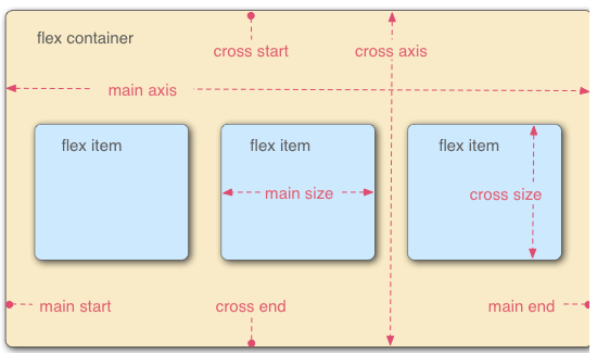
摘要:什么是呢答是的缩写,意为弹性布局这个东西的引入,为盒模型提供了最大的灵活性可以相应式的实现各种页面的布局。基本概念采用布局的元素,称为容器,简称容器。在这个容器中默认存在两个轴水平方向的主轴和垂直方向上的交叉轴。 很多人不明白这个display:flex是到底是什么东西,如何使用的 。 1.什么是display:flex呢? 答:flex是 flexible box的缩写,意为弹性布局 ;...
阅读 858·2023-04-25 19:43
阅读 4130·2021-11-30 14:52
阅读 3936·2021-11-30 14:52
阅读 4040·2021-11-29 11:00
阅读 3930·2021-11-29 11:00
阅读 4054·2021-11-29 11:00
阅读 3788·2021-11-29 11:00
阅读 6629·2021-11-29 11:00