1.常见的两列布局
1.1左边固定,右边自适应,左边宽度已知,右边默认占满整行,使用left 左浮动,右边不浮动,设置margin-left:左侧宽度
 style
 .box{
 overflow: hidden;
 height: 500px;
 background-color: bisque;
 .box .box-left {
 margin-left: 10px;
 width: 200px;
 min-height: 100%;
 float: left;
 background-color: pink;
 .box .box-right {
 margin-left: 220px;
 margin-right: 10px;
 height: 100%;
 background-color: green;
 header,footer {
 height: 75px;
 background-color: aqua;
 /style
 div
 div
 /div
 div
 1shishsihsishsihi是不变的沙发电视柜很多水果和客户的感慨的沙发电视柜很多水果和客户的感慨大苏打撒郭德纲你只是 第三个大概了解斯大林经过拉丝几个垃圾
 /div
 /div
1.2右侧固定,宽度已知,左侧自适应,记住固定的区域一定要放自适应区域的右边,
.box{
 height: 500px;
 background-color: bisque;
 position: relative;
 .box .box-right {
 float: right;
 width: 200px;
 min-height: 100%;
 margin-right: 10px;
 background-color: pink;
 .box .box-left {
 margin-left: 10px;
 margin-right: 220px;
 height: 100%;
 background-color: green;
 header,footer {
 height: 75px;
 background-color: aqua;
 div
 div
 /div
 div
 1shishsihsishsihi是不变的沙发电视柜很多水果和客1111111111111111111111户的感慨的沙发电视柜很多水果和客户的感慨大苏打撒郭德纲你只是
 第三个大概了解斯大林经过拉丝几个垃圾
 /div
 /div
单列固定都是比较简单的还有嵌套一层div方式,还有弹性布局方式,还有grid布局,都能实现单侧固定
1.3 嵌套一层div ,左侧固定,右侧自适应布局,使用双浮动,右侧自适应先写入,左侧使用margin-left:-100%
不嵌套一层div,右侧直接使用margin-left:左侧宽度也是可以的(这个代码就不写了,和第一个差不多)
 style
 .box{
 height: 500px;
 background-color: bisque;
 position: relative;
 overflow: hidden;
 .box .box-right {
 float: left;
 margin-left: -100%;
 width: 200px;
 min-height: 100%;
 background-color: pink;
 .box .box-left {
 float: left;
 width: 100%;
 height: 100%;
 background-color: green;
 .box .box-left .son {
 margin-left: 210px;
 header,footer {
 height: 75px;
 background-color: aqua;
 /style
 body
 header
 /header
 div
 div
 div
 1shishsihsishsihi是不变的沙发电视柜很多水果和客1111111111111111111111户的感慨的沙发电视柜很多水果和客户的感慨大苏打撒郭德纲你只是
 第三个大概了解斯大林经过拉丝几个垃圾
 /div
 /div
 div
 /div
 /div
 footer
 /footer
 /body
1.4 t弹性布局
 style
 .box{
 height: 500px;
 background-color: bisque;
 position: relative;
 display: flex;
 .box .box-left {
 margin-left: 10px;
 flex: 0 0 200px; /* 参数分别是 放大,缩小 初始大小 */
 background-color: pink;
 .box .box-right {
 margin-left: 10px;
 margin-right: 10px;
 height: 100%;
 background-color: green;
 header,footer {
 height: 75px;
 background-color: aqua;
 /style
 body
 header
 /header
 div
 div
 /div
 div
 1shishsihsishsihi是不变的沙发电视柜很多水果和客1111111111111111111111户的感慨的沙发电视柜很多水果和客户的感慨
 大苏打撒郭德纲你只是 第三个大概了解斯大林经过拉丝几个垃圾
 /div
 /div
 footer
 /footer
 /body
1.5 grid布局,grid相对于flex的话属于二维布局,可以定义行数,定义列数,定义行高列高,宽度也可以自适应,设置父容器的display:grid。grid 有很大的兼容性问题。慎用
使用grid 相当于设置行数为1,列数为2的grid布局,使用grid可以很容易实现九宫格布局
 style
 .box{
 height: 500px;
 background-color: bisque;
 position: relative;
 display: grid;
 padding: 0 10px;
 grid-template-rows: 1fr;
 grid-template-columns: 200px auto;
 grid-gap: 10px;
 .box .box-left {
 background-color: pink;
 .box .box-right {
 background-color: green;
 header,footer {
 height: 75px;
 background-color: aqua;
 /style
 body
 header
 /header
 div
 div
 /div
 div
 1shishsihsishsihi是不变的沙发电视柜很多水果和客1111111111111111111111户的感慨的沙发电视柜很多水果和客户的感慨
 大苏打撒郭德纲你只是 第三个大概了解斯大林经过拉丝几个垃圾
 /div
 /div
 footer
 /footer
 /body
使用grid实现9宫格布局
 style
 .box{
 height: 500px;
 background-color: bisque;
 position: relative;
 display: grid;
 padding: 0 10px;
 grid-template-rows: 1fr 1fr 1fr;
 grid-template-columns: 1fr 1fr 1fr;
 grid-gap: 10px;
 .box .box-left {
 background-color: pink;
 .box .box-right {
 background-color: green;
 header,footer {
 height: 75px;
 background-color: aqua;
 /style
 body
 header
 /header
 div
 div
 /div
 div
 1shishsihsishsihi是不变的沙发电视柜很多水果和客1111111111111111111111户的感慨的沙发电视柜很多水果和客户的感慨
 大苏打撒郭德纲你只是 第三个大概了解斯大林经过拉丝几个垃圾
 /div
 div
 /div
 div
 1shishsihsishsihi是不变的沙发电视柜很多水果和客1111111111111111111111户的感慨的沙发电视柜很多水果和客户的感慨
 大苏打撒郭德纲你只是 第三个大概了解斯大林经过拉丝几个垃圾
 /div
 div
 /div
 div
 1shishsihsishsihi是不变的沙发电视柜很多水果和客1111111111111111111111户的感慨的沙发电视柜很多水果和客户的感慨
 大苏打撒郭德纲你只是 第三个大概了解斯大林经过拉丝几个垃圾
 /div
 div
 /div
 div
 1shishsihsishsihi是不变的沙发电视柜很多水果和客1111111111111111111111户的感慨的沙发电视柜很多水果和客户的感慨
 大苏打撒郭德纲你只是 第三个大概了解斯大林经过拉丝几个垃圾
 /div
 div
 /div
 /div
 footer
 /footer
 /body
View Code
1.6 使用定位实现左侧固定右侧自适应布局,
1.6.1使用相对定位,该布局,左侧固定div 的高度已知,
 style
 .box{
 height: 500px;
 background-color: bisque;
 position: relative;
 .box .box-left {
 margin-left: 10px;
 width: 200px;
 height: 400px;
 background-color: pink;
 .box .box-right {
 position: relative;
 top: -100%;
 margin-left: 220px;
 height: 100%;
 background-color: green;
 margin-right: 10px;
 header,footer {
 height: 75px;
 background-color: aqua;
 /style
 body
 header
 /header
 div
 div
 /div
 div
 1shishsihsishsihi是不变的沙发电视柜很多水果和客1111111111111111111111户的感慨的沙发电视柜很多水果和客户的感慨
 大苏打撒郭德纲你只是 第三个大概了解斯大林经过拉丝几个垃圾
 /div
 /div
 footer
 /footer
 /body
View Code
1.6.2 使用相对定位实现左侧固定,右侧自适应,div高度未知,将自适应的模块放前面,固定宽度div设置top:-100%
 style
 .box{
 height: 500px;
 background-color: bisque;
 position: relative;
 .box .box-left {
 position: relative;
 top: -100%;
 margin-left: 10px;
 width: 200px;
 height: 400px;
 background-color: pink;
 .box .box-right {
 margin-left: 220px;
 height: 100%;
 background-color: green;
 margin-right: 10px;
 header,footer {
 height: 75px;
 background-color: aqua;
 /style
 body
 header
 /header
 div
 div
 1shishsihsishsihi是不变的沙发电视柜很多水果和客1111111111111111111111户的感慨的沙发电视柜很多水果和客户的感慨
 大苏打撒郭德纲你只是 第三个大概了解斯大林经过拉丝几个垃圾
 /div
 div
 /div
 /div
 footer
 /footer
 /body
View Code
1.6.3 使用绝对定位,两个模块都使用绝对定位,可以不使用浮动
 style
 .box{
 height: 500px;
 background-color: bisque;
 position: relative;
 .box .box-left {
 position: absolute;
 margin-left: 10px;
 width: 200px;
 height: 400px;
 background-color: pink;
 .box .box-right {
 position: absolute;
 margin-left: 220px;
 height: 100%;
 background-color: green;
 margin-right: 10px;
 header,footer {
 height: 75px;
 background-color: aqua;
 /style
 body
 header
 /header
 div
 div
 1shishsihsishsihi是不变的沙发电视柜很多水果和客1111111111111111111111户的感慨的沙发电视柜很多水果和客户的感慨
 大苏打撒郭德纲你只是 第三个大概了解斯大林经过拉丝几个垃圾
 /div
 div
 /div
 /div
 footer
 /footer
 /body
View Code
1.6.4 左侧先放入固定模块,设置定位为绝对定位,右侧模块无论使用什么定位,只要margin-left:左侧宽度,
都能实现这个布局
 style
 .box{
 height: 500px;
 background-color: bisque;
 position: relative;
 .box .box-left {
 position: absolute;
 margin-left: 10px;
 width: 200px;
 height: 400px;
 background-color: pink;
 .box .box-right {
 margin-left: 220px;
 height: 100%;
 background-color: green;
 margin-right: 10px;
 header,footer {
 height: 75px;
 background-color: aqua;
 /style
 body
 header
 /header
 div
 div
 /div
 div
 1shishsihsishsihi是不变的沙发电视柜很多水果和客1111111111111111111111户的感慨的沙发电视柜很多水果和客户的感慨
 大苏打撒郭德纲你只是 第三个大概了解斯大林经过拉丝几个垃圾
 /div
 /div
 footer
 /footer
 /body
View Code
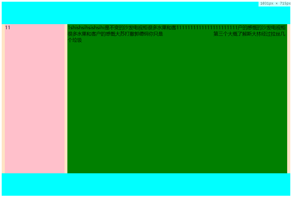
上面所以布局的实现图
总结,左侧固定右侧自适应布局
1、不使用定位,左侧固定,浮动,右侧,设置margin-left:左侧宽度
2、不适用定位,左侧固定,浮动,右侧也浮动,,右侧模块一定要写在左侧模块之前,左侧使用margin-left:-100%
2.1右侧使用margin:左侧宽度,
2.2左侧设置宽度100%,嵌套一层div,设置margin:左侧宽度(这种方式有点多余,在两列布局上)
3、使用定位,父元素设置display:relative(为啥不使用absolute,子元素要是设置也是absolute,
那么都不知道跑什么地方去了)
3.1 左元素不设置定位,右侧元素设置相对定位display:relative;则,有点设置top:左侧高度,margin:左侧宽度
3.2 左侧宽度不定,则将左侧和右侧元素都设置为相对定位,右侧元素先放入页面,左侧设置top:-100%.右侧设置
margin-left:左侧宽度(3.1的左侧高度要已知,而这个左侧高度可以不已知)
3.2 左侧元素为绝对定义,则右侧元素直接设置margin-left:左侧宽度,(left,margin-left,对于自适应的
宽度,margin会使宽度变窄,而left 是不会的,如果要是用left:左侧宽度,那么一定要设置margin-right:左侧宽度)
4、使用flex布局,单列布局,设置父元素display:flex;左侧元素的flex为;:0 0 width;右侧元素不用设置
5、使用grid布局,grid布局是二维布局,设置为1行,1列,第一列宽度为定位宽度,第二列宽度为auto,子元素不用设置
上面基本上覆盖了所以的左侧固定,右侧自适吟的布局,第一种最简单, 4 5 有一定兼容性问题,flex常用语移动端。
如果您还有更好的方法,请给我留言。
文章版权归作者所有,未经允许请勿转载,若此文章存在违规行为,您可以联系管理员删除。
转载请注明本文地址:https://www.ucloud.cn/yun/791.html
摘要:目录一大结构上的导航栏和内容区域两栏布局博客园为例腾讯课堂个人中心页慕课网个人中心页个人中心页二版的结构三类似九宫格布局的两列结构四图文两列布局左图右文字非垂直居中,左图,右固定行数的文字,右侧文字和左边图片垂直居中。目录:一、大结构上的导航栏和内容区域两栏布局1、博客园为例2、腾讯课堂个人中心页3、慕课网个人中心页4、github个人中心页二、mini版的nav+cont结构三、类似九宫格...
摘要:本文概要本文将介绍如下几种常见的布局其中实现三栏布局有多种方式,本文着重介绍圣杯布局和双飞翼布局。借助等高布局正负可解决,下文会介绍双飞翼布局特点同样也是三栏布局,在圣杯布局基础上进一步优化,解决了圣杯布局错乱问题,实现了内容与布局的分离。 本文概要 本文将介绍如下几种常见的布局: showImg(https://segmentfault.com/img/remote/14600000...
摘要:本文概要本文将介绍如下几种常见的布局其中实现三栏布局有多种方式,本文着重介绍圣杯布局和双飞翼布局。借助等高布局正负可解决,下文会介绍双飞翼布局特点同样也是三栏布局,在圣杯布局基础上进一步优化,解决了圣杯布局错乱问题,实现了内容与布局的分离。 本文概要 本文将介绍如下几种常见的布局: showImg(https://segmentfault.com/img/remote/14600000...
摘要:本文概要本文将介绍如下几种常见的布局其中实现三栏布局有多种方式,本文着重介绍圣杯布局和双飞翼布局。借助等高布局正负可解决,下文会介绍双飞翼布局特点同样也是三栏布局,在圣杯布局基础上进一步优化,解决了圣杯布局错乱问题,实现了内容与布局的分离。 本文概要 本文将介绍如下几种常见的布局: showImg(https://segmentfault.com/img/remote/14600000...

阅读 1840·2023-04-25 20:36
阅读 2678·2021-09-02 15:11
阅读 1464·2021-08-27 13:13
阅读 2775·2019-08-30 15:52
阅读 6564·2019-08-29 17:13
阅读 1239·2019-08-29 11:09
阅读 1640·2019-08-26 11:51
阅读 1076·2019-08-26 10:56